Weeknote CW32 (S3E1)
Questions this season are from Question Cards.
Ok, let’s go.
Pre-started a new project with Cryptic Limited to do a real co-design project for people who are ordinarily disadvantaged by some of their legacy services. Very exciting but we have a crunched timeline and budget.
Company names are always made up and change week to week.
A project for Driftonics that was on a low simmer has come to the boil. I’ve roped in two fairly senior consultants to help. They’re doing an awesome job.
Our standardised training program is coming along. The two-hour sessions are almost planned. That only leaves the two-day sessions.
This might be the last week before I go into a month of training delivery for Beedlescape.
Also, went out for lunch with the team a a cool faux-Mexican place. Great vibe but the food was 3.5/5.
What are my expectations?
I expect the coming week to be increasingly busy. That training delivery for Beedlescape is going to need some preparation.
How did it make me feel?
This week felt good. Just busy enough, but with a good variety of things to think about and people to talk to.
What is truly important to me?
Work-wise, the most important thing is to maintain and increase the capability of my team. I’m about to launch a Research Skills program, so expect updates on that in future episodes.
Family-wise, it’s about to get to the pointy end of the year for everyone. The mental-health baseline of the house is going to be important to maintain and sustain.
Which decisions am I not making?
Gosh, question cards. Ask an easy one. I think I’m stalling on making space and time for planning the last third of the year. Sometimes it feels like there’s too much day-to-day to take time for the longer term view.
The Importance of Storytelling
Every designer should know the importance of storytelling1.
As a designer, you’re always telling stories. Design projects have a beginning, middle and end. We answer the call, we try things, we fail, we overcome adversity and hopefully we succeed.
The challenge, in 2022, is that clients and stakeholders love numbers and efficiency. We stop having narratives and and we start showing graphs. Or we focus on disconnected features rather than a consistent through-line that makes the features make sense.
Clients want numbers, but they remember stories.
I’m following Danah Abdulla’s Designerly Ways of Knowing↩︎
The Different Typeface Classifications
Every designer should know the different typeface classifications1.
If you’re a designer it might surprise you to know that civilians2 often struggle to tell the different between typefaces. They might be able to tell the difference between Arial and Times New Roman. They probably can’t really tell the difference between Arial and Calibri — and they almost certainly don’t have the vocabulary to say how they’re different.
They might know to make fun of Comic Sans but the difference between Arial and Helvetica is beyond most people, not just civilians.
Anyway, there are two main kinds of type: serif and sans-serif. Those get broken down into sub-types3.
Serif
- Humanist/Old Style type that reference “roman lettering” and calligrapic techniques. They key feature is a variable stroke width, similar to what you get when writing with a nib pen.
- Slab serif/Egyptian/Clarendon type that has, unsurprisingly, serifs that are slabs. I think this is about the fiddly distinction between serifs that look like they came from a pen and those that don’t.
- Transitional/neoclassical type that is a bit like Humanist styles but is less influenced by how letters are constructed by a person holding pen.
Sans-Serif
For us to perceive something as perfectly geometric, it’s necessary for the type designer to apply optical corrections. Overshoots, ovals instead of perfect circles, horizontals at 90% thickness of the verticals, crossbars above the midpoint, etc. — From Google Fonts
- Geometric type is designed based on simple shapes.
- Grotesque & Neo-grotesque. Apparently grotesque was the first sans-serif style and it was awkward. Neo-grotesque is a tidied up version.
- Humanist is a classification can apply to sans-serif type as well as serif. Sans humanist type has the same characteristics as serif humanist, no serifs.
I’m following Danah Abdulla’s Designerly Ways of Knowing↩︎
I.E. non-designers↩︎
Totally stealing these definitions from the excellent Google Fonts↩︎
The Basics of Layout
Every designer should know the basics of layout.1
I don’t design books, and despite ostensibly being a UX designer, I don’t design apps or websites. I do design slides, (or possibly slidedocs).
Slides are single pages, so the Canons of Page Construction tend not to work for them. I do love a good construction diagram though.
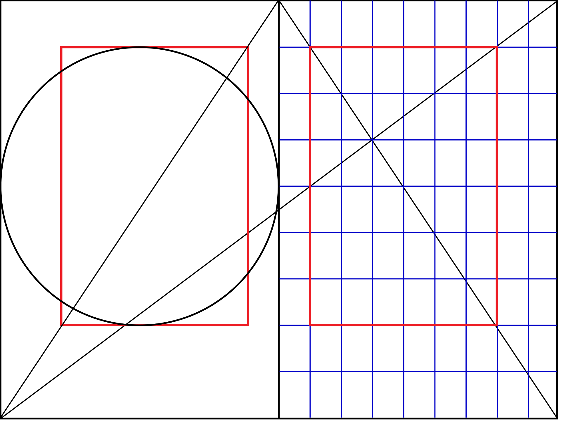
For slides, I start with a 14x8 grid in Keynote. I built my first one using the instructions in this Medium post. The outer columns and rows are gutters, so the actual working space is 12x6.
Type sizes are trickier. I tend towards the safety of a 1:2 ratio of type sizes. That is, if you start with a 24pt base size you double the type size for each level up in your type hierarchy. Though a golden ratio is probably more pleasing.
After that, for me, the basics of layout lean towards thinking about visual hierarchy. And practice.
I’m following Danah Abdulla’s Designerly Ways of Knowing↩︎
Designerly Ways of Knowing
I bought Danah Abdulla’s Designerly Ways of Knowing the other day. It’s a “guidebook/notebook of things designers should think about in order for them to know”.
I’m going to see if I can work through the book at about a post a day.
Instagram, the grotesque mutant begging for death in Zuckerberg’s basement that he continues to inflict his unholy experiments upon, is adrift in a tidal wave of bad press
Just Enough is More
Being a child of modernism i have heard this mantra all my life. Less is more. One morning upon awakening I realized that it was total nonsense, it is an absurd proposition and also fairly meaningless. But it sounds great because it contains within it a paradox that is resistant to understanding. But it simply does not obtain when you think about the visual of the history of the world. If you look at a Persian rug, you cannot say that less is more because you realize that every part of that rug, every change of colour, every shift in form is absolutely essential for its aesthetic success. You cannot prove to me that a solid blue rug is in any way superior. That also goes for the work of Gaudi, Persian miniatures, art nouveau and everything else. However, I have an alternative to the proposition that I believe is more appropriate. ‘Just enough is more.’
Power of Three
One woman on a board is a token, two is a presence and three is a critical mass.
— via a tweet from Yo Szczepańska, a follow up from Cameron Tonkinwise and this paper by Kramer, Konrad, Erkut, and Hooper.
I'm @bjkraal@aus.social on Mastodon