The Basics of Layout
Every designer should know the basics of layout.1
I don’t design books, and despite ostensibly being a UX designer, I don’t design apps or websites. I do design slides, (or possibly slidedocs).
Slides are single pages, so the Canons of Page Construction tend not to work for them. I do love a good construction diagram though.
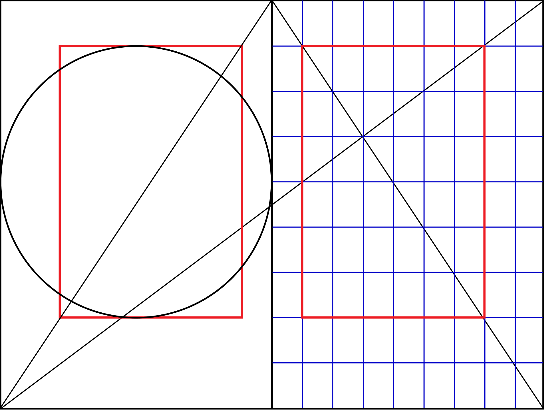
For slides, I start with a 14x8 grid in Keynote. I built my first one using the instructions in this Medium post. The outer columns and rows are gutters, so the actual working space is 12x6.
Type sizes are trickier. I tend towards the safety of a 1:2 ratio of type sizes. That is, if you start with a 24pt base size you double the type size for each level up in your type hierarchy. Though a golden ratio is probably more pleasing.
After that, for me, the basics of layout lean towards thinking about visual hierarchy. And practice.
I’m following Danah Abdulla’s Designerly Ways of Knowing↩︎